Use charts to visualize data and track progress directly in Notion
Whether you need to track project timelines, analyze team performance, or simply make sense of large datasets, charts offer a solution that transforms your database pages into actionable information.
- How your database becomes a chart
- Combine charts to create a dashboard
- 3 ways to use charts for your team
- Create an OKR dashboard for your leadership team
- Visualize what’s coming with your product roadmap
- Deepen understanding of your content library
- Enhance your existing project management suite with charts
With Notion’s connected workspace, you can get your projects to the finish line faster and with less context switching. But without visualizations, managing large amounts of tasks can be cumbersome. Charts take your project management to the next level, helping you to monitor project progress, spot trends, and make decisions.
With Notion charts you can:
Visualize your project in realtime — Forget about separate tools or tedious copy-pasting. When you add charts from Notion databases, they’ll update automatically whenever a change is made to the underlying data or tasks.
Make more informed decisions — Looking at hundreds of tasks in a database can be overwhelming. Charts let you easily spot trends, monitor progress, and make decisions to move forward quicker than you might be able to otherwise.
Break free from complicated analytics tools — We all love our data partners, but we’d prefer not to need them for absolutely everything. With charts, anyone can make beautiful visualizations in a few clicks using the UI they already know (and, hopefully, love!)
In this guide, we’ll cover how to make a chart, and discuss ways that you can use them to improve your project management in Notion.
Charts work like any other database view — meaning you can view the same data in multiple ways, and switch back and forth between them depending on your needs. To create a view, simply navigate to the + button in your database and select “Chart.” Within your chart view, you can filter your data, and customize your chart to craft a perfect picture of your project’s progress.

Looking for charts docs?
Notion charts come with 4 layout options, each serving a unique purpose:
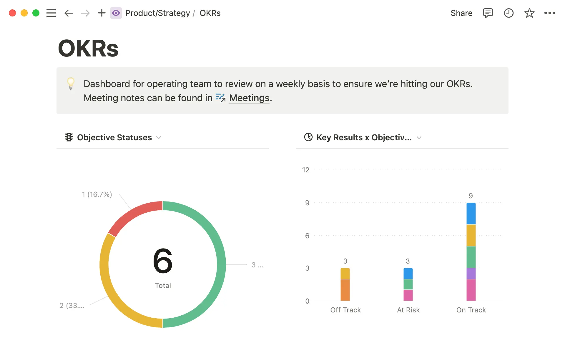
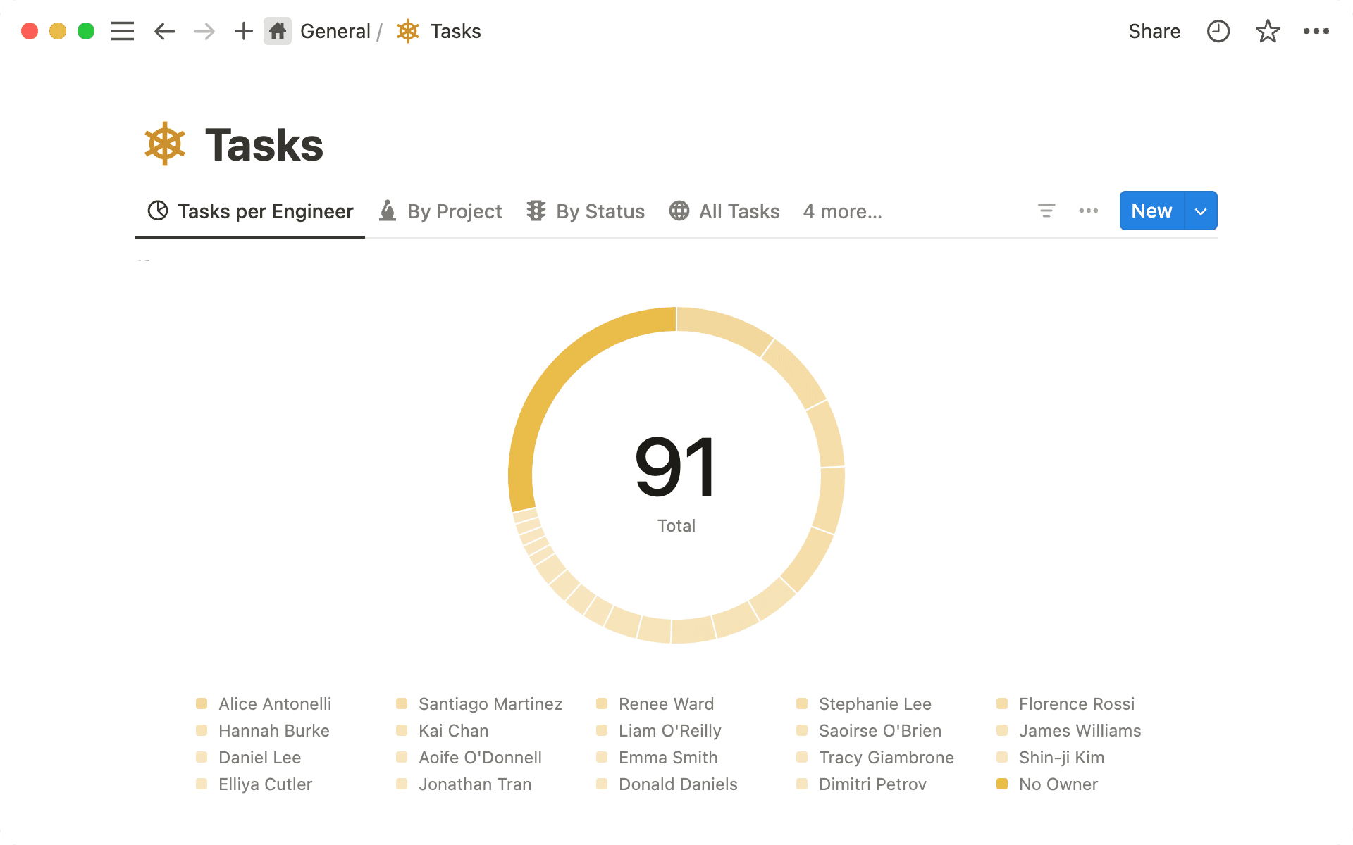
Donut charts for simple distribution — Donut charts are a simple option for visualizing the distribution of tasks across different categories or team members, providing a clear view of resource allocation. For example, you might use one to analyze and balance the task load across your engineering team in a given sprint.
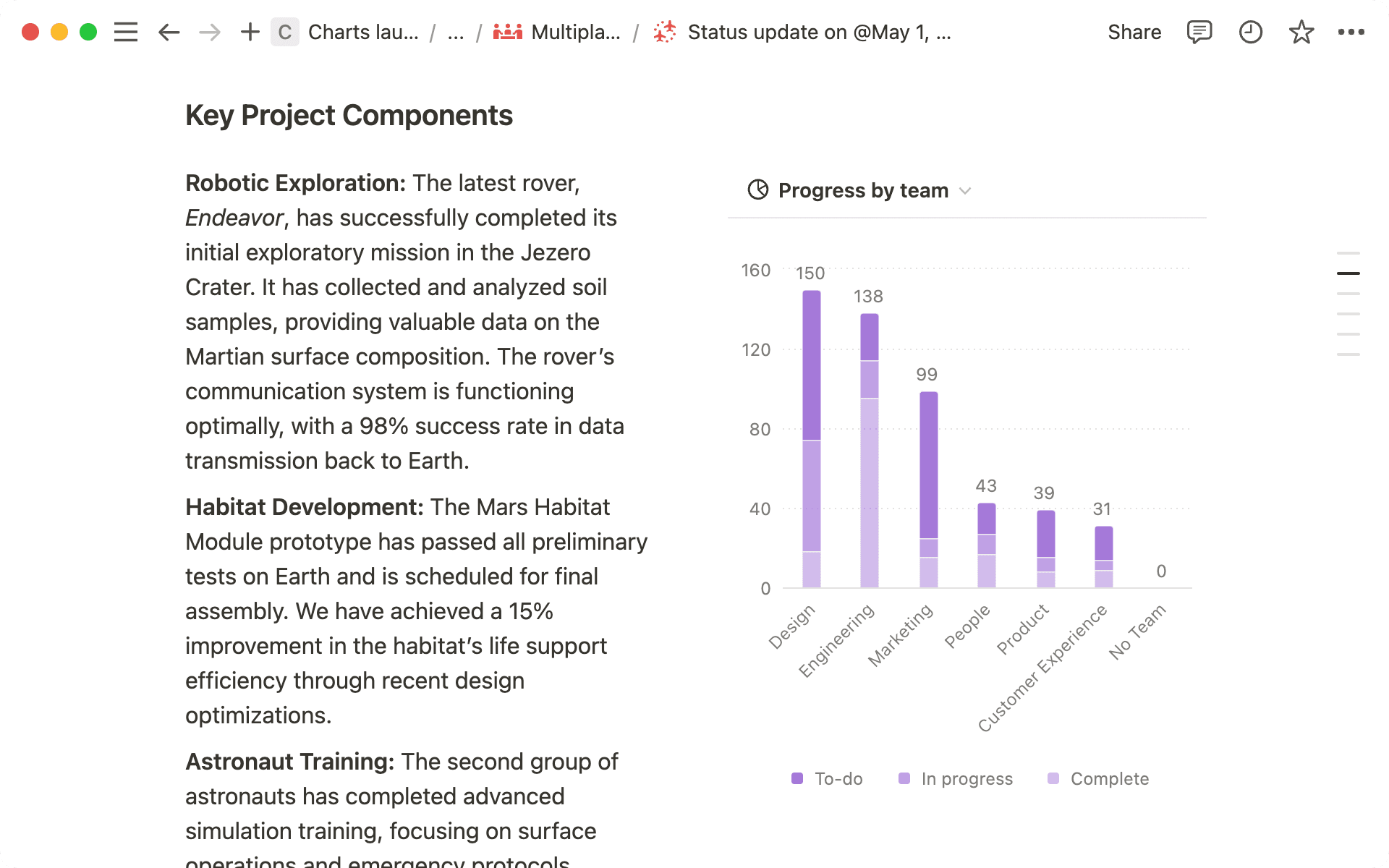
Horizontal and vertical bar charts for multi-dimensional categorization — Bar charts let you view database items with sub-groups, helping you quickly compare two categories, like status and task type. You might use a one of these to understand OKR progress by team and identify a bottleneck in your operating model.
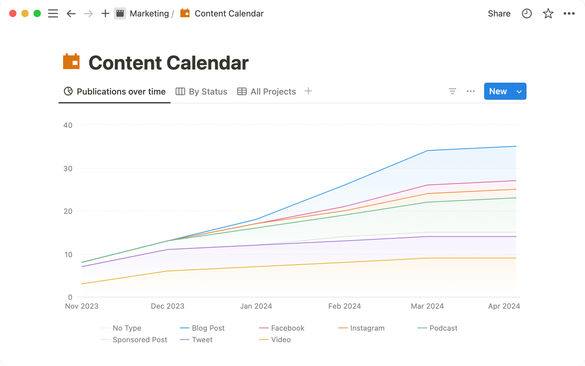
Line charts for progress over time — Line charts are best for tracking the progress of tasks over time, and can even be used to compare sub-groups. Like the number of pieces published each week in a given quarter, broken down by channel; or the number of tasks completed over time, by engineer.
As mentioned, you’ll also be able to sort and filter the data in your chart, add axis and data labels, and even customize your color palate. Learn more in the video below:
Uh-oh! It looks like your ad blocker is preventing the video from playing.
Please watch it on YouTube
Now that you’ve got the basics, let’s dive in to how charts help your work in the real world.
Combine charts to create a dashboard
Since charts are database views, you can create them anywhere in Notion by navigating to the page where you want the view to appear and typing /chart. Here you’ll be prompted to link an existing database. Do this multiple times, and you’ll be able to make a dashboard that lets you visualize data from multiple databases, or from the same database (in multiple ways!) in a single place.
The beauty of Notion’s connected workspace means that unlike a chart created based on static data in a spreadsheet, these dashboards are living records of the work going on across your team, and they update in realtime. Use them for one database, or many. You might want to:
Centralize scattered tracking systems — if you have teams working across different project trackers (like your engineering tasks, and marketing campaign calendar), consider creating a dashboard to visualize the status of both projects simultaneously.
Get an in-depth view of important work — similarly, you might want to create a dashboard to view different cuts of the same database. Like an OKR dashboard that highlights different project statuses, key result progression, and tasks completed over time.
Visualize team progress across projects — as a team manager, you could create a dashboard to understand individual performance, irrespective of project statuses. Here, you might look at tasks assigned to each of your reports, overall projects each team member is on, and more.
So how can you use charts (and dashboards!), to enhance your work? Let’s consider three different kinds of projects that we commonly see managed inside of Notion.
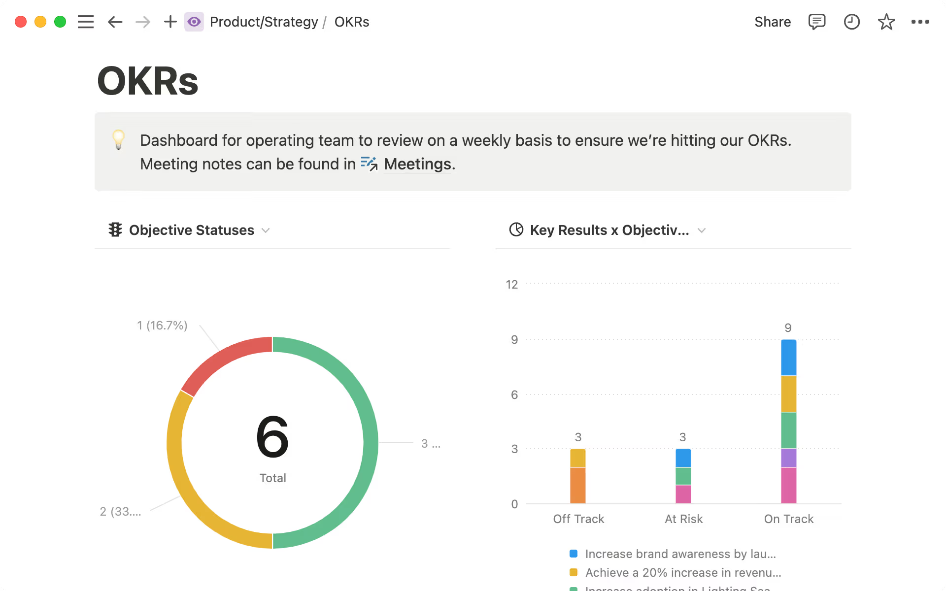
Create an OKR dashboard for your leadership team
Charts help visualize OKRs, making it easier to track progress, enhance decision-making, and improve accountability. By analyzing trends and communicating goals clearly, teams can stay agile and keep leadership informed without creating an additional burden of reporting.
You might consider creating a bar chart of OKR status by team to identify and mitigate potential risks. Similarly, a line chart of key result progress over time can help identify which teams have momentum, and those that might be slowing down.
Visualize what’s coming with your product roadmap
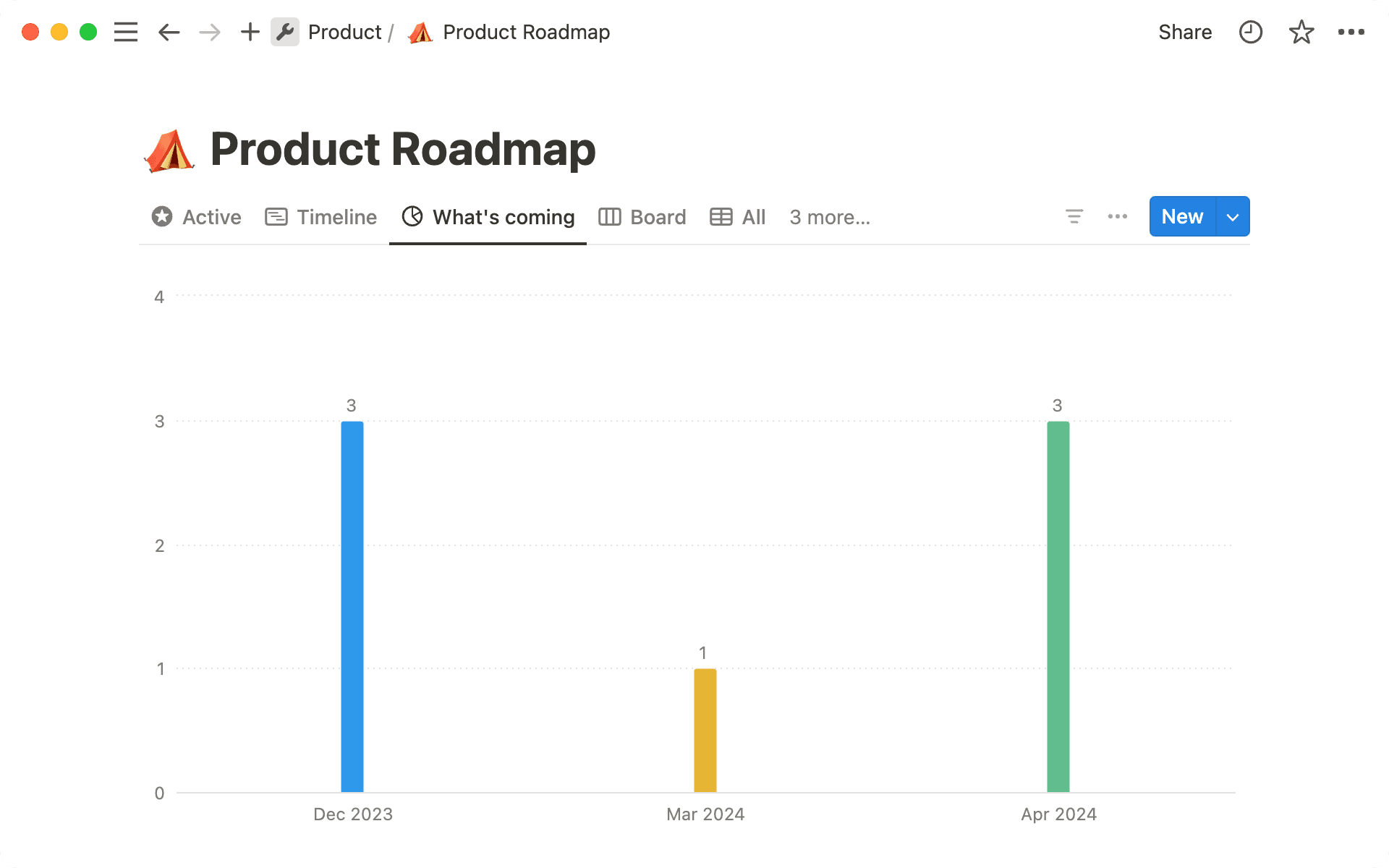
Charts offer a strategic view of your product roadmap, enabling your team to allocate resources efficiently and prioritize features with precision. By visualizing upcoming features and their timelines, you can ensure that your team stays on track and meets key milestones, ultimately leading to a more streamlined and effective development process.
Deepen understanding of your content library
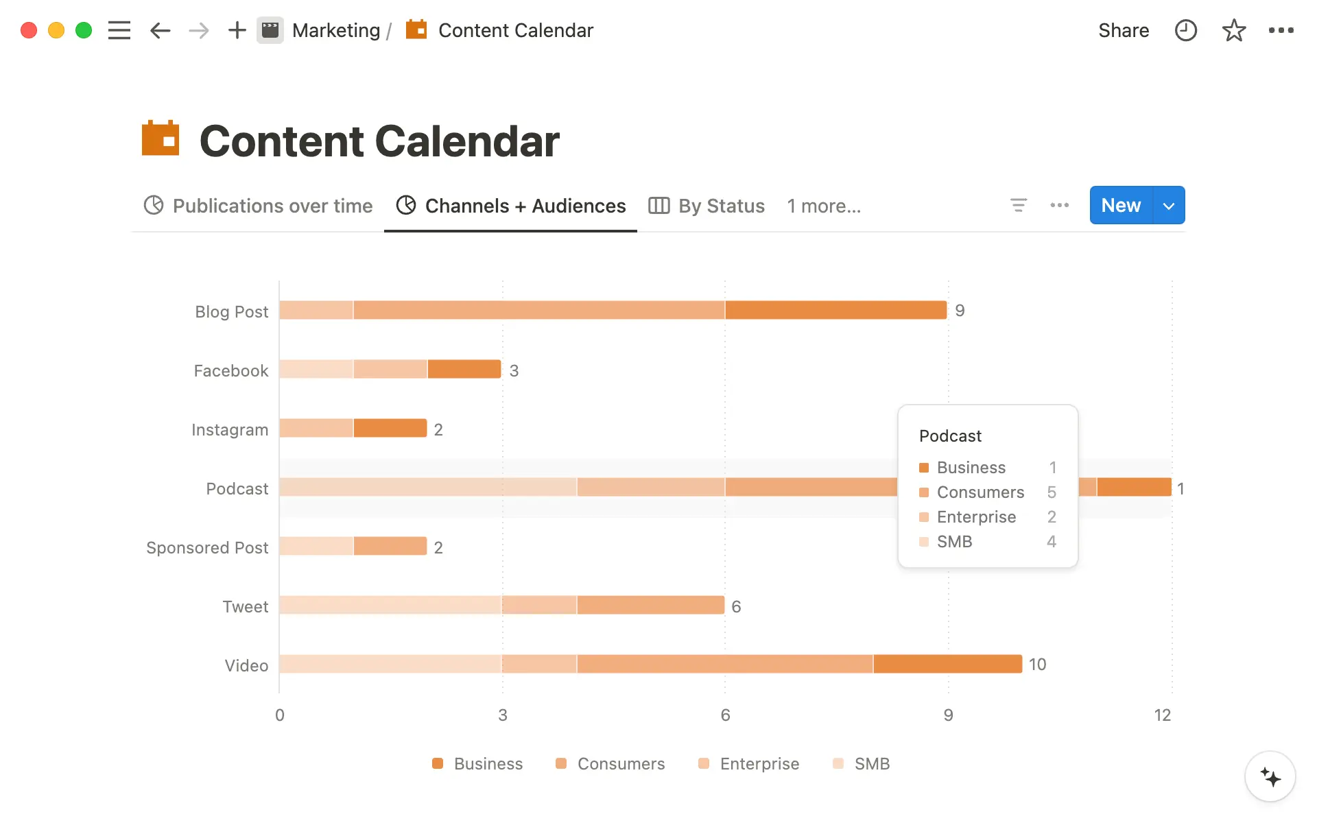
If you manage your content calendar in Notion, you can use charts to understand both in progress and published content at a glance.
You might use a line chart track content scheduling and publishing to maintain a consistent release schedule. This helps identify delays or inconsistencies in your workflow.
At the same time, you can visualize content distribution by tagging pieces based on channel in a bar chart. This ensures that each audience segment receives the appropriate amount of content and could help you refactor plans to make sure all of your audience’s needs are met.
While this guide covered the bulk of what you need to know to get started, the possibilities for using charts are pretty endless, especially when combined with other project management features in Notion. Here are a few more advanced ways to use charts in your workspace:
Turn synced databases into a chart — Synced databases pull information from tools like Jira, Asana, and GitHub into your Notion workspace to let you visualize 3rd party tasks as a Notion database. Consider turning these synced databases into charts so that your project manager can get a view of what’s happening across all of these different tools in one glance.
Visualize AI-generated content tags — With AI autofill, you can generate tags for every row in your database based on page content in seconds. Why not use charts to visualize those tags? This makes for quick exploration of large data sets with very little work to audit and tag your data in the first place.
Embed charts from different data sources in your dashboard — You can embed charts from external data sources such as Tableau, Mixpanel, or Google Analytics into Notion. Add these alongside the charts you’re using for project tracking to create a comprehensive view of your team’s performance, without leaving the Notion app.

Exporting charts from Notion
When used thoughtfully, charts can act as a powerful addition to your Notion workspace, enhancing your ability to manage projects and visualize data. Utilize them to gain clearer insights and streamline your workflow. For now, if you’re not sure where to start, check out the templates below!

Templates with charts
You can add a chart to any of your existing databases, or get started with some of our favorites:
This OKR tracker helps you track your team or company goals in one streamlined place.
Content teams can use the content calendar to keep track of both in-flight and published pieces.
Or try the product roadmap, personal finance dashboard, or sales CRM to get inspired with more charts use-cases.
Something we didn’t cover?