A consistent brand is a strong brand.
And when we say consistent, we don’t just mean using the same logo for everything. We’re referring to a brand that looks the same in all its iterations, all the time — which can be anything from the animations on your website to the adjectives in your ads.
Companies with remote teams, collaborative marketing projects, and help from third-party graphic designers need a reference that ensures anyone who touches the brand — from a social media marketing team to event planners — is working with the same information. Enter coherent brand guideline templates to create and track your identity.
What are brand guidelines?
Brand guidelines detail the core elements of a company’s identity, especially the visual elements. This document or web page usually contains information on the color scheme, fonts, and voice a company uses in marketing materials, with detailed notes on how to employ them. Correctly using these guidelines ensures a brand looks and reads the same anywhere it appears, whether that’s on an infographic or in a press release.
To achieve this level of consistency, comprehensive brand manuals need to include a lot of information. This could be instructions on how to set the type, which font sizes and weights to use and when, and grayscale alternatives to the traditional color palette. There might also be rules for using logos in different media, like print materials, social media, or product packaging. For copy, guidelines might include tone attributes, like “playful” or “authoritative,” along with slogans or taglines to use. It all depends on the company.
4 critical elements of brand identity
Think of a company you interact with or purchase from often, like Instagram or Doordash. You can likely call to mind the brand logo, color scheme, and even the tone of voice that the company uses.
That means it has effectively set brand guidelines, and your organization can do the same — as long as you’re willing to explore your identity and set clear rules. If you want to create brand guidelines, here are four critical elements your style guide should include:
Color scheme — “red and yellow” looks different in everyone’s head, so be specific. Brand kits need clear color instructions, down to the codes (like HEX, CMYK, or RGB). This way you’ll ensure that everyone at your company, along with third-party graphic designers and printers, consistently uses the same exact tones.
Logos and iconography — your style guide should contain all logo versions and instructions for displaying them. But it does depend on how strict you want to be. Some brands have a logo containing a byline and a simpler rendition of the image for other uses. Some also have a monogram with the company's initials for tight spaces. Along with different versions, including information on how to set your logo on websites and print materials, delineating how much of a bumper should surround the image to prevent crowding.
Fonts — write down information on company lettering for different types of text, like headings, subheadings, and body paragraphs. Often, fonts come in varieties, like italics, light, and so on. If your company typography contains many of these variations, it’s time to get specific. Maybe you only want to permit some variations, like prohibiting italics or only using bold text.
Voice — branding is about more than just visuals. Include pointers on your company voice: the tone your brand uses in its marketing copy and communications. It defines readers' or listeners' perception of your brand, so don’t forget to specify. An upbeat voice and a formal tone have totally different effects.
Tips for creating brand guidelines
Learning how to create brand guidelines requires a profound understanding of the spirit of your company and the power of visual elements. The following tips can help you tap into both of these critical considerations:
Rely on your mission statement — choosing brand elements you like is tempting, but they may not represent your company as a whole. Get in touch with your company’s values and mission and keep them in mind when setting rules. If you’re unsure how your values should “look,” try researching competitors with similar identities. You can also familiarize yourself with color meanings to choose a scheme, like how blue inspires trust or yellow sparks joy.
Get professional help — you’ll use your brand elements long into the future, so it's worth hiring a designer to help ensure that you start with a stellar baseline. These professionals understand color theory, how to correctly space visual assets, and the process of combining images and fonts in a legible, appealing way. Plus, professional designers who make style guides for a living know how to create a comprehensive kit — including elements you might have overlooked on your own.
Document your choices — a style guide shouldn’t be a frazzled collection of visual elements. It’s a tool, and anyone who uses your branding in marketing materials or communication should be able to access and navigate it easily. Save and organize image files and font kits in a central place, like a Notion page, so team members can quickly locate them.
Use easy-to-replicate elements — uniqueness is essential, but if brand elements are so unique they’re hard for designers to find or recreate, your image can lose its coveted consistency. You want people to be able to use your brand guidelines with ease. Decide on standard fonts, colors that render well in print and digital components, and logos that aren’t so detailed they look grainy when enlarged or illegible when shrunk.
3 brand guidelines examples from real companies
Companies often make their brand guidelines documents available to the public, whether for potential press or easy access for new hires. That means it’s easy to learn from real-life examples and find inspiration from companies you admire. Here are a few iconic brands to guide you:
Netflix

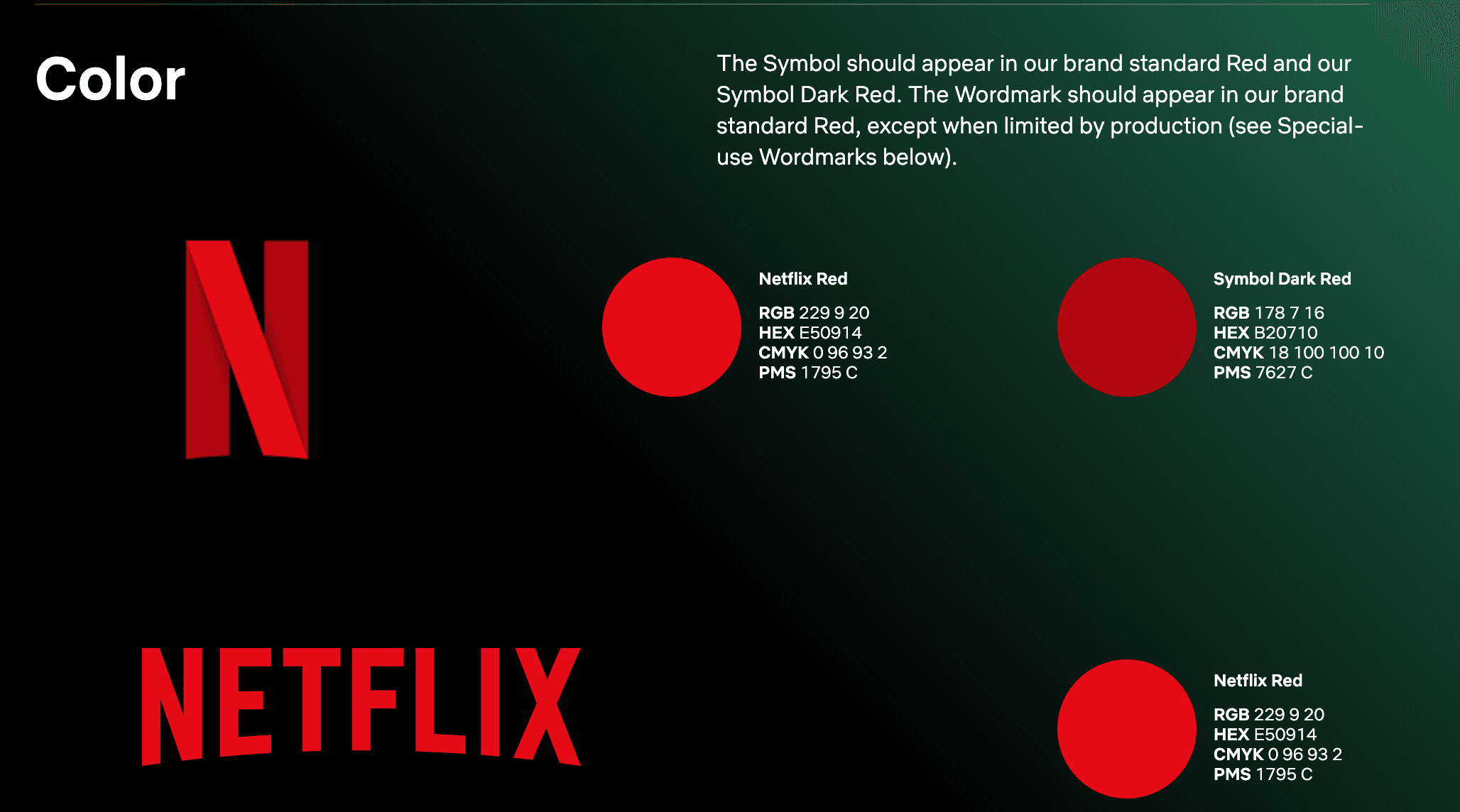
The streaming powerhouse’s brand guide contains all the information and tips a third-party designer or marketer would need. The company explains the use of the “N” symbol, the Netflix wordmark, and brand hues, including the color codes for “Netflix Red.”
Netflix also provides guidance on readability and contrast, ensuring that the logo is legible and prominent in any context. There’s also a list of things not to do, with clear examples, to avoid potential mistakes.
Starbucks

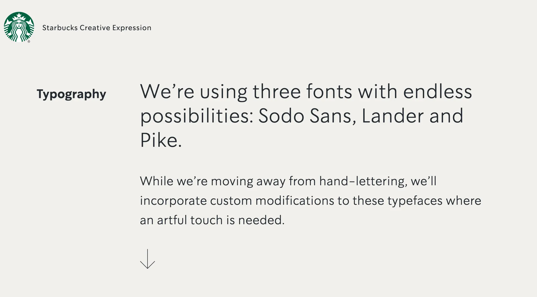
The world’s most popular coffee company gives designers straightforward instructions in a navigable brand guide, with sections for voice, illustrations, and more. Even Starbucks’ brand kit itself upholds the visual guidelines, making it a key example of proper execution.
One of the most effective aspects of this brand guide is the table of contents. Starbucks organizes every element into categories — including theory and case studies — so viewers can easily navigate and find what they need.
Discord

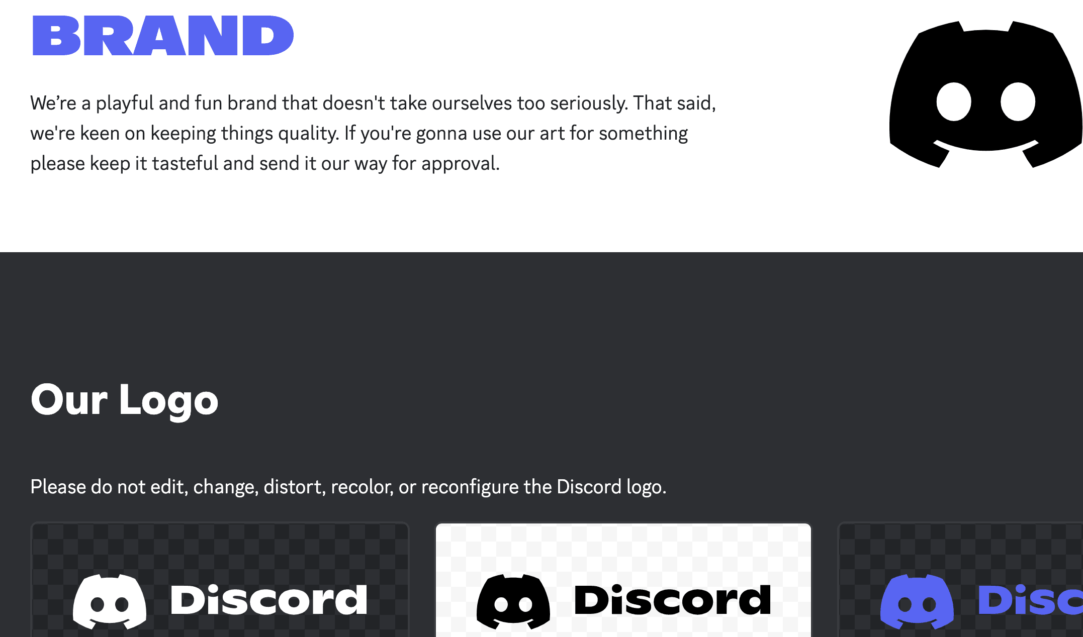
Instant messaging platform Discord heads up its brand kit by reminding users that it’s “playful,” with a short blurb that reflects the exact tone. The minimalist guide on the company’s website gets right to the point, showing users how to correctly use the logo, providing color codes and swatches, and inviting them to download more in-depth instructions in an extensive press kit.
Templates to help you create a brand style guide
The success of your brand’s identity lies in the details, which ensure consistency no matter who uses your style guide or where. And templates let you cover all bases. These Notion templates can accompany you as you create a compelling brand book:
Brand assets

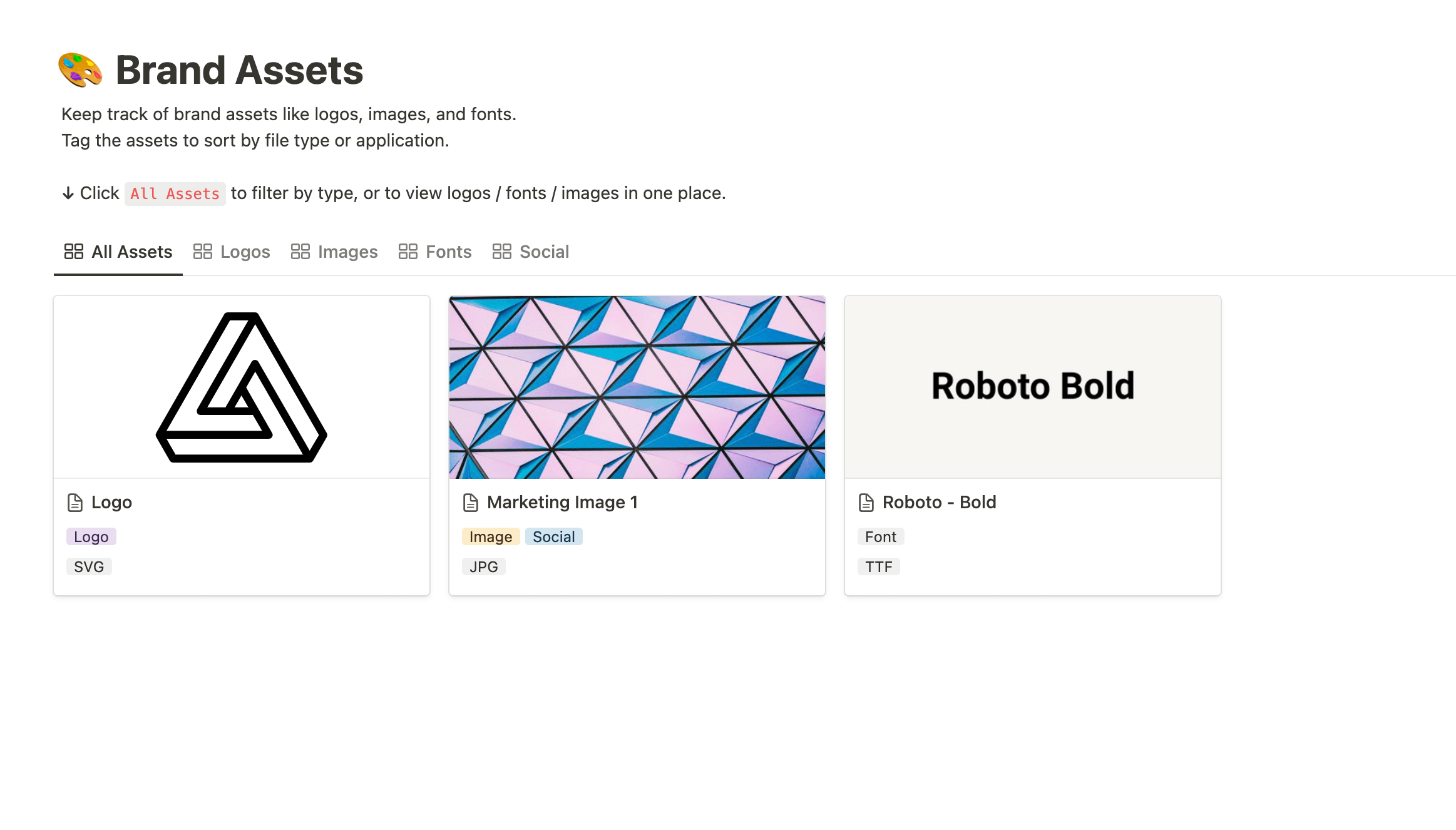
Notion’s brand assets template is a space where you can save brand elements, like logos, images, and fonts, so anyone on your team can quickly access them. This template also allows searchers to filter by type and application. It’s all about function and efficiency, and if you’re looking for a quick style solution, it offers just that.
Mood board
If you’re starting from scratch, creating a mood board helps you explore visuals that align with the feel of your brand. You can save images in any category you could possibly need, from specific campaigns to logo inspiration. And once you do have brand guidelines in place, this mood board doc becomes an excellent reference for designers who want to understand the core of your ideas, values, and vision.
Netflix’s branding framework
Explore Netflix’s branding prowess even further with this template that takes you through the how-to of creating a strong identity. Former Netflix VP of Product Management Gibson Biddle shows you how to make a lasting impression on your target audience. This is less of a brand guideline and more of a supporting document, but it’s a vital part of discovering your identity.
The more you know, the more you grow
Notion doesn’t stop at providing brand guide templates. While you build your company’s identity, check out more blog posts for entrepreneurs, business owners, and marketers.
Read up on defining your company’s mission, vision, and values, and get inspired by Notion’s personal branding story. Creating brand rules is just one piece of the puzzle — use Notion to build your whole business.

